Note
Click here to download the full example code
Adding a color pallete to a figure
Plotting a map with a color pallete is handled by pygmt.Figure.grdimage. The
pygmt.makecpt method creates a custom color pallete that can be used with
the figures and color bars.
import pygmt

# Load sample earth relief data
grid = pygmt.datasets.load_earth_relief(resolution="05m", region=[-86, -64, 17, 24])
Out:
grdblend [NOTICE]: Remote data courtesy of GMT data server OCEANIA [https://oceania.generic-mapping-tools.org]
grdblend [NOTICE]: Earth Relief at 5x5 arc minutes from Gaussian Cartesian filtering (9 km fullwidth) of SRTM15+V2.1 [Tozer et al., 2019].
grdblend [NOTICE]:   -> Download 180x180 degree grid tile (earth_relief_05m_p): S90W180
Create a plot with color
The pygmt.Figure.grdimage method takes the grid input and optional
region argument to create a figure. It creates and applies a color pallete to the
figure based upon the z-values of the data. By default, it plots the map with the
equidistant cylindrical projection and with no frame.
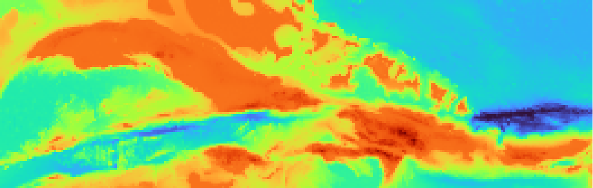
fig = pygmt.Figure()
fig.grdimage(grid=grid)
fig.show()
Out:
<IPython.core.display.Image object>
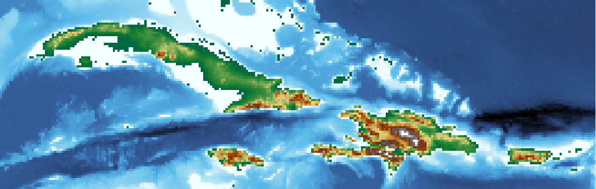
A specific color pallete can be set using the optional cmap argument for
pygmt.Figure.grdimage. By default, the color pallete is set to turbo.
In the example below, the color pallete is set to geo.
The full list of color palette tables can be found at https://docs.generic-mapping-tools.org/latest/cookbook/cpts.html.
fig = pygmt.Figure()
fig.grdimage(grid=grid, cmap="geo")
fig.show()
Out:
<IPython.core.display.Image object>
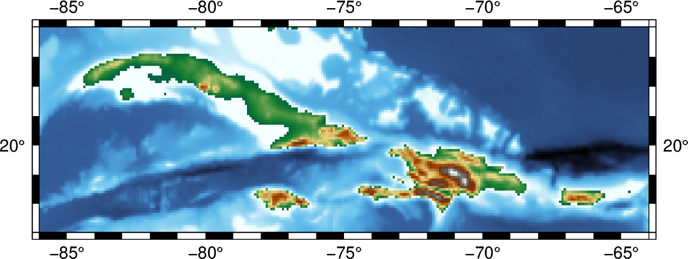
pygmt.Figure.grdimage accepts additional parameters, including frame and
projection.
fig = pygmt.Figure()
fig.grdimage(grid=grid, frame=True, projection="M6i", cmap="geo")
fig.show()
Out:
<IPython.core.display.Image object>
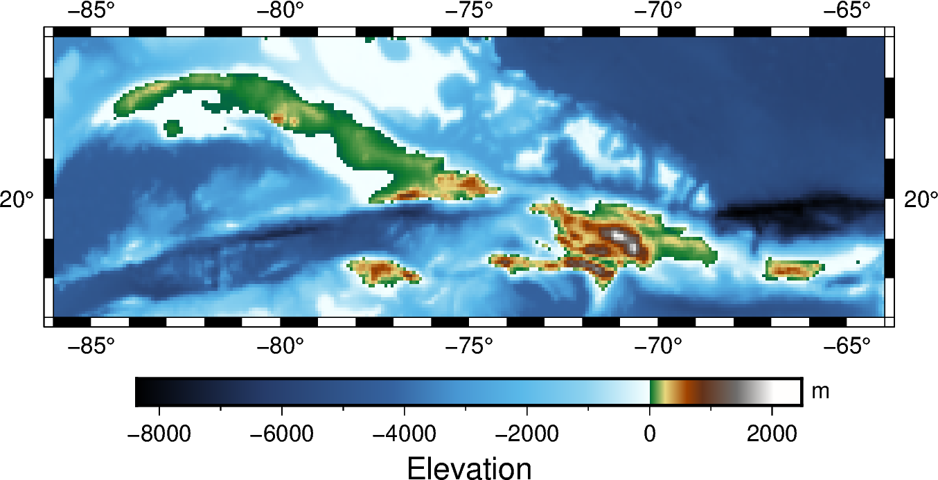
The pygmt.Figure.colorbar method can be used to add a color bar to the figure.
By default, it applies the color pallete created by pygmt.Figure.grdimage.
fig = pygmt.Figure()
fig.grdimage(grid=grid, frame=True, projection="M6i", cmap="geo")
fig.colorbar(frame=["x+lElevation", "y+lm"])
fig.show()
Out:
<IPython.core.display.Image object>
Create a custom color pallete
The pygmt.makecpt method provides the option to create a custom color pallete
for a figure. The cmap argument sets the master color pallete to base the
new color pallete on. The series argument sets the minimum and maximum values, and
optionally the intervals between them; without it, the new color pallete defaults to
the min/max values of the master color pallete. The series argument can be given
as a string (as below) or as a list series=[-8500, 2500, 1000]. Any values that
fall outside the range of the series will be plotted as black (lower than the minimum)
or white (higher than the maximum).
The pygmt.makecpt method includes an output parameter, which allows the
custom color pallete to be saved in a .cpt file. It’s default value is False, which
uses the custom color pallete as the default color pallete for
the figure and color bar.
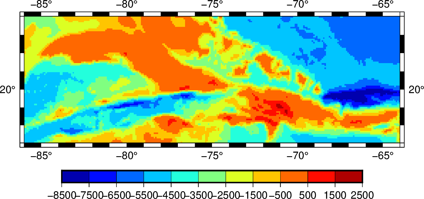
fig = pygmt.Figure()
pygmt.makecpt(cmap="jet", series="-8500/2500/1000")
fig.grdimage(grid=grid, projection="M6i", frame=True)
fig.colorbar()
fig.show()
Out:
<IPython.core.display.Image object>
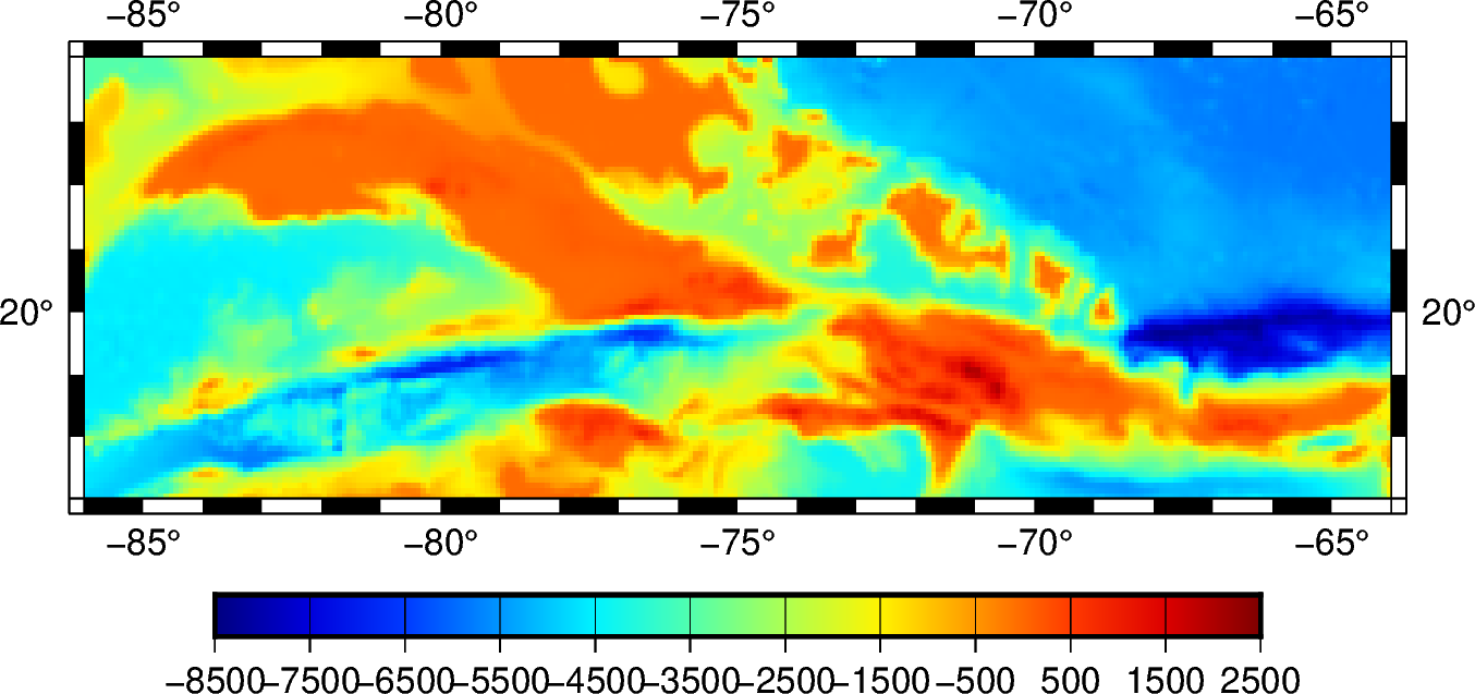
The continuous argument forces the custom color pallete to be continuous or
discrete. Discrete color palletes will have a single color for a range of values
within the color pallete, while continuous color palletes will assign a different
color for every value in its series.
fig = pygmt.Figure()
pygmt.makecpt(cmap="jet", series="-8500/2500/1000", continuous=True)
fig.grdimage(grid=grid, projection="M6i", frame=True)
fig.colorbar()
fig.show()
Out:
<IPython.core.display.Image object>
Total running time of the script: ( 0 minutes 6.187 seconds)